Home
Byte
Designing a product team and strategy to deliver a company-strategic mobile app

My role
On this project, I was the Lead Product designer. I supervised three other product designers and together we worked with product management, customer support, Salesforce team, and development to deliver iOS and Android apps in about 6 months.
Skills used
Design Leadership
User Research
Design Systems
Mobile Design
Byte needed to deliver a mobile app to meet strategic company goals, ASAP. Their immediate problem was they didn’t have a team to plan and design it. That’s where yours truly came in.
I was hired as Lead Designer to head up this strategic company priority, on a pretty aggressive timeline. I was joining an existing design team of one which had limited product design experience and no native mobile design experience. There were also no design system and no user research practice in place — so clearly lots to do!
First steps
Understand the org
Byte's headquarters are in LA, manufacturing and treatment planners are in Costa Rica, and the customer support team is distributed throughout the US. Before getting to work on design, I wanted to understand who did what and how things really got done at Byte.
Start a Design System
Byte had a mature brand identity, but no product design system, so I immediately got to work setting one up in Figma based on brand and web design assets.
Building the team
Create and document team practices
I knew we were going to hire designers for the project so I documented all team practices, processes, and tools in order to get them working effectively as quickly as possible.
Level up our designers
The designers we hired had strong foundational product design skills, but most didn’t have experience building a robust design system. I enrolled everyone in Figma Academy so we could all learn to leverage Figma components and prototyping to their fullest.
Defining the product strategy
Identify the business objectives
A primary challenge we faced at Byte was that customers felt frustrated when their treatment got off track; either because of non-compliance or, more frequently, they were confused around their treatment plan and didn’t know who to contact. This often resulted in customers needing to backtrack, refine, and extend their treatment plan.
All this confusion and lack of oversight left customers feeling alone and unaccountable — lowering NPS score. So ultimately, the business goal was to increase our NPS score.
We got to work researching, documenting, and defining the current user journey our customers were experiencing.
By interviewing customers, internal support staff, and executives three key themes began to emerge:
The themes and insights above helped us formulate the goals for the app:
The Treatment Loop - a mental model for the app
We designed a mental model called the “Treatment Loop”. This systems-thinking visualization and term helped everyone understand the system and how it could expand in the future.
Starting the user research practice
When I started, Byte had no user research practice at all. Based on the teaching of Teresa Torres, I championed us to start a “Continuous Discovery” practice which included building a pipeline to interview and test users on a weekly basis.
This was a huge undertaking with lots of moving parts (recruiting, scheduling, recording interviews, paying incentives), but well worth it. We immediately started finding new insights. For example, the first 3 people we interviewed were parents of patients, an audience we hadn't considered at all during design. This was a huge opportunity to explore further.
Design and development
Then we got to work designing, prototyping, and coding. Suffice it to say, we learned a lot along the way and continued to improve feedback and processes as we went. This will be a Case Study itself one day.
Results
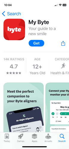
It took about six months to formulate, design, and build Byte’s mobile app for iOS and Android. It was a complete success with Byte customers, raising NPS from 2 to 38. The app is currently rated 4.7 stars with 14k ratings.

4.7 stars in Apple App Store
with 14k ratings


